Instabridge
Outline
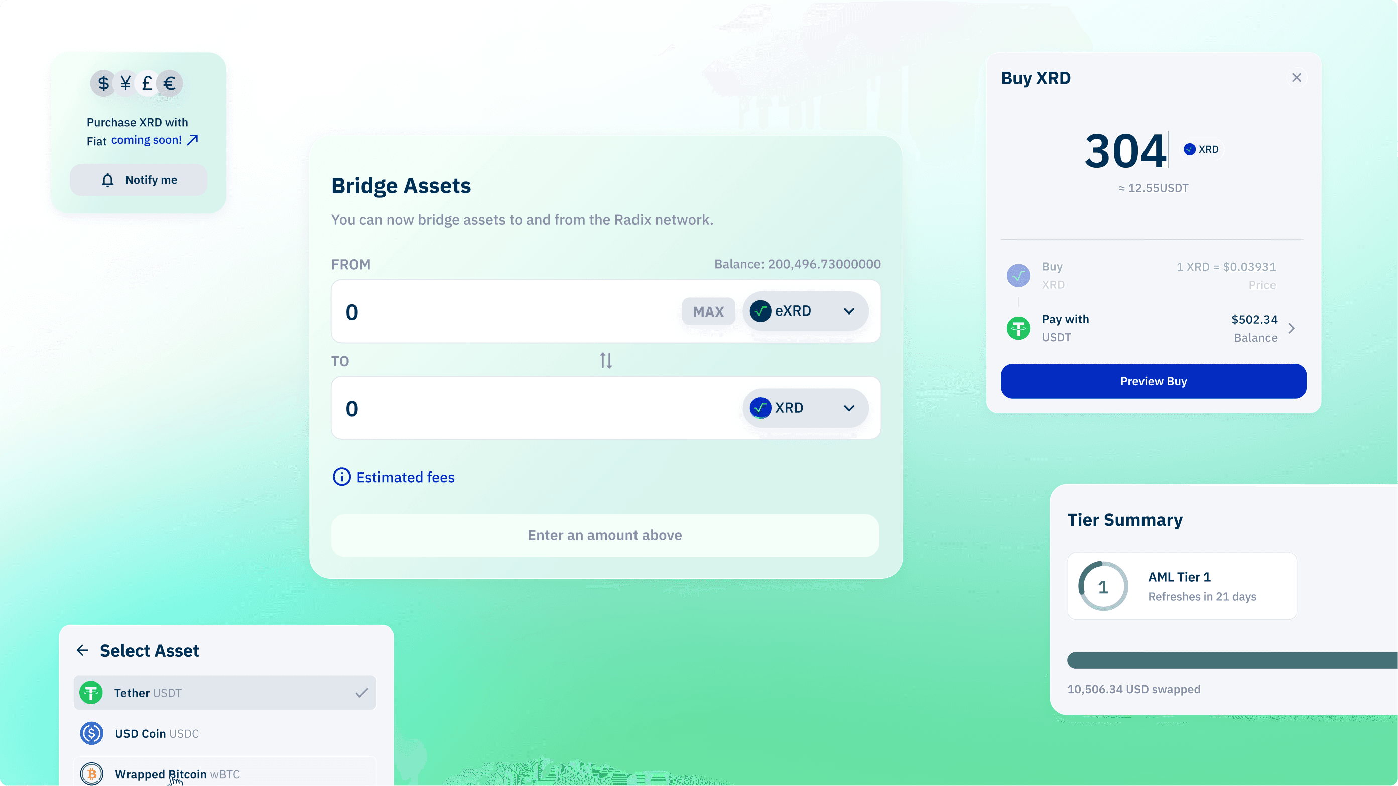
Instabridge is a 2-way bridge between the Ethereum and Radix networks, facilitating 1:1 asset swaps and wrapping services.
My Role
Solo Product Designer — Research, Identity, Visual Design, Prototyping
Team
Dean Murphy, PM
Azizi Adeyemo, DEV
Katy Simmons, COMP
Timeline
3 Months

Research
The application faces critical challenges affecting user experience and efficiency.
Overview
Users face delays in transaction processing without sufficient notifications, leading to frustration. The platform lacks a secure, tidy look and feel, missing the desired 'banking' experience.
Solution
Redefine the platform's look and feel, creating a secure, tidy, and visually pleasing environment that mirrors a seamless banking experience for users. Enhance the user guidance during the process of committing transactions.
Audit of the current experience
1
No dollar amount
No indication of dollar amount conversion from eXRD/XRD amount.
2
Lack of typographic hierachy
As a general rule, every design should include three levels of hierarchy: heading, subheading, and body text. This section doesn't follow this rule and it makes all the information look messy.
3
Yearly cap indicator
We need to indicate when the yearly cap A. resets or B. a countdown.
4
Conversion
User has to manually calculate the amount.
5
No transaction search option
No search option on transaction filters and no transaction id for submitted transaction.
6
Opening the transaction details
When opening the transaction details there is a lot of information here, and it takes up a lot of space when a a few transactions are open at once.
Starting a new transfer old version
The process of transferring tokens faced several technical issues, including:
When clicking the transfer button there is no signal telling the user that this is happening in the background.
Some transfers get sent but not processed and then Compliance has to refund it.
Users required to delete the 0 in the input field, and the max button gives an incorrect amount.
Choosing user types
In our quest to enhance the user experience of Instabridge, we started engaging with a diverse spectrum of individuals based on their familiarity and engagement with cryptocurrency. This aimed to gather deep insights into the needs, concerns, and expectations of potential users across various levels of crypto involvement.
As Instabridge and Instapass cross paths in this journey it was appropriate to use these user types across both platforms.
Our research identified five distinct user segments:


Bridging gaps, token by token.
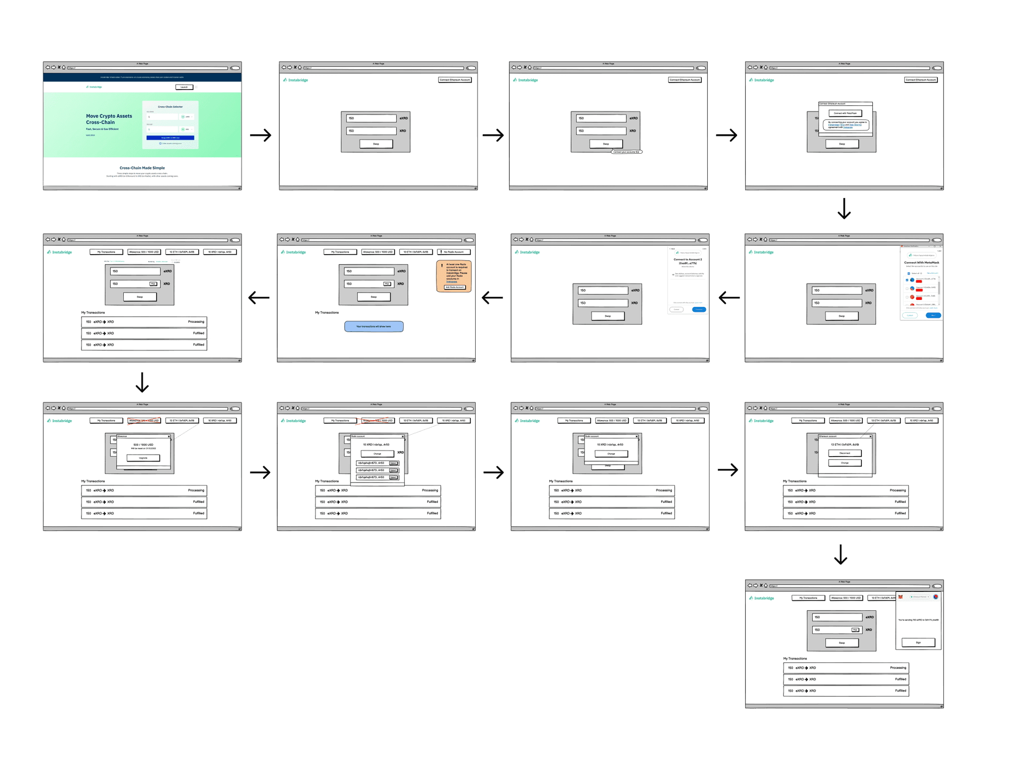
After profiling our user types and outlining their individual journeys for each tier, I conducted iterative testing with the same user groups. Armed with valuable feedback, I swiftly translated these insights into tangible user experiences by creating wireframes for the token bridging process via Instabridge. This rapid design sprint ensured a responsive and user-friendly interface, aligning with the diverse needs and expectations we uncovered during our research and testing phases.

Identity
Gaining trust from our users.
To enhance trust and usability, I resolved design inconsistencies by creating a comprehensive style guide. This guide serves as a reference for a unified design language, ensuring consistency across screens and reinforcing a cohesive and trustworthy visual identity. These improvements collectively contribute to a more intuitive, secure, and efficient user experience within Instapass.


Design

Outcome
Before
1. Scattered Experience: Users struggled to manage staking in one place.
2. Low Trust: Concerns about platform security and transparency.
3. No Design System: Slow, inconsistent updates.
After
1. Unified Dashboard: Centralised staking management.
2. Higher Trust: Clear UI boosted confidence.
3. Faster Iterations: Design system streamlined updates.
Learnings
1. User Trust: Clear design fosters confidence in managing assets.
2. Stakeholder Feedback: Regular input streamlined design iterations.
3. Design System: Improved consistency and sped up development.


