Radix Staking Dashboard
Outline
Radix wanted to introduce a new an improved version of their previous “explorer” and have a more comprehensive service. The interface should ensure participants can easily stake their tokens, manage their staking preferences, and view their potential rewards.
My Role
Solo Product Designer — Research, Identity, Visual Design, Prototyping
Team
Eduardo Martin, PM
Dawid Sowa, DEV
Alex Wormbs, DEV
Alex Stelea, DEV
Timeline
3 Months

Research
Smooth validator staking with detailed insights
Overview
Our current function allows our users to stake to validators is poor and inefficient. We need a place where users can see a list of validators and be able to directly stake there. We need to display a specific amount of information on this list for each validator so the user understands the unique value they each offer.
Solution
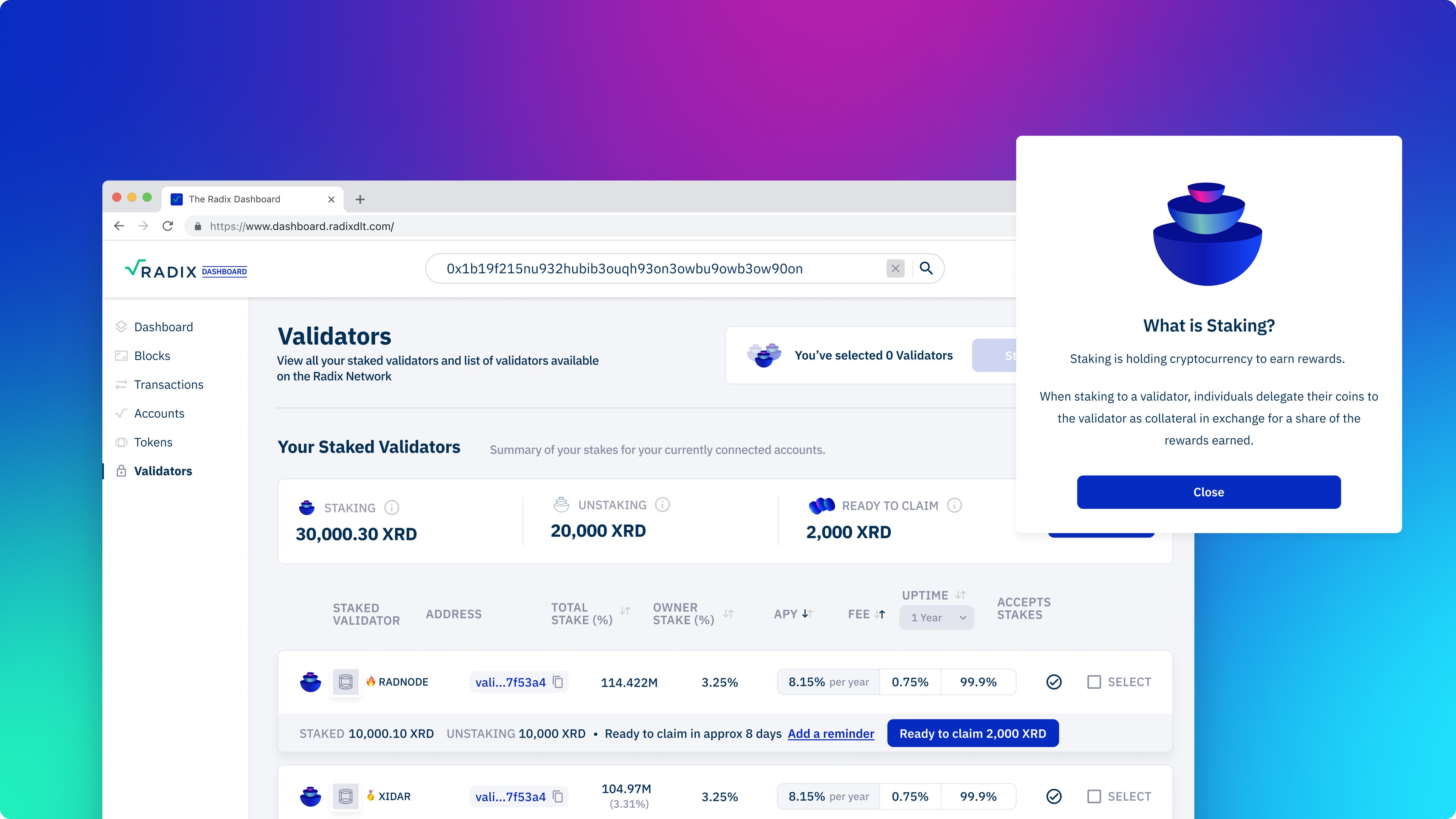
Create a new groundbreaking dashboard which will have a section that gives users the ability to stake to multible validators. This list presents users with key information about each validator, such as their performance metrics, descriptions, and contact details. To streamline the staking process, users will be able to stake with a single click directly from this list.
Audit of the current experience
1
It's worth noting that a striking box placed prominently in the middle of the table is quite unusual and potentially off-putting for users. It's also hard to read and understand.
2
The different sizes in fonts are quite bad hierarchy on the page, this makes it hard to identify where the user should start their journey.
3
The overall branding appears disjointed, failing to align with our updated design language and the cohesive Radix identity we aim to project.
4
We've identified critical user experience gaps, notably the inability for users to stake to multiple validators or bookmark preferred validators for future engagement.
5
Users currently face a limitation in that they cannot access a summary of all their staked assets or initiate unstaking directly from this view, necessitating a visit to the desktop wallet for this essential functionality.
The old experience
Branding inconsistencies and readability issues
Our current design, characterised by overwhelming colours and branding inconsistencies, presents challenges in readability and usability, particularly in the absence of features for staking to multiple validators or bookmarking preferences.
Understanding user needs
While we did not conduct formal user interviews or surveys, we made it a priority to comprehend the needs and preferences of potential Radix stakers. Through a combination of online forums, social media discussions, and community feedback, we gathered valuable insights into what users were looking for when choosing a validator for staking.
User Flow
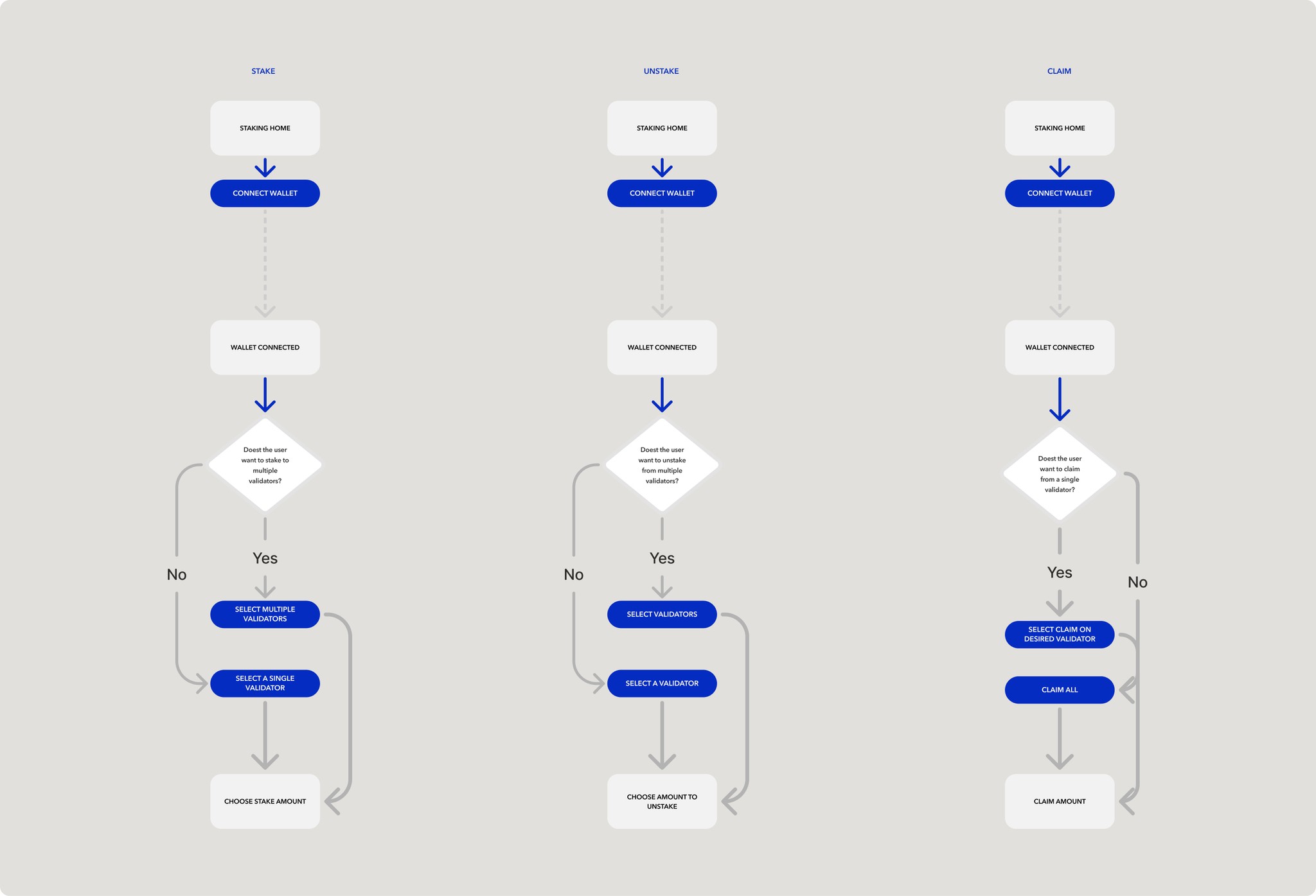
The user flow was mapped out to ensure I had an idea of how the users would achieve their goals as well as the business needs of having more stakes on the ecosystem. This mean creating a simple easy to follow flow to get users from connecting their wallet to making a stake on the ecosystem. Also giving the option to claim and unstake tokens they are entitled to.

Key Findings
Trust and transparency
Users prioritise validators that are transparent about their operations and staking performance. Trust is a crucial factor when selecting a validator, and users often seek validators with a proven track record.
Performance metrics
Stakers are interested in real-time and historical performance metrics, including metrics related to uptime, rewards, and commissions. They want easy access to this information to make informed decisions.
User-friendly interface
Users and stakeholders expect a user-friendly interface that simplifies the staking process. The ability to delegate and manage staked assets should be intuitive and straightforward.
Identity

Design
Final design
Polished experience
After implementing the initial designs, I polished several key features, most notably the staking overview, to ensure a smoother and more intuitive staking process. These refinements aim to elevate the overall user experience, providing a visually engaging and user-centric platform for users to explore and interact with validators on the Radix network.

Outcome
Before
1. Scattered Experience: Users struggled to manage staking in one place.
2. Low Trust: Concerns about platform security and transparency.
3. No Design System: Slow, inconsistent updates.
After
1. Unified Dashboard: Centralised staking management.
2. Higher Trust: Clear UI boosted confidence.
3. Faster Iterations: Design system streamlined updates.
Learnings
1. User Trust: Clear design fosters confidence in managing assets.
2. Stakeholder Feedback: Regular input streamlined design iterations.
3. Design System: Improved consistency and sped up development.


